Submit Inquiry
Please expect 24 hours for inquiry response.


Current
Complete website redesign for the future of banking
- Content Strategy
- UX Design
- Visual Design
- Design System
- UI Motion
- Prototyping
As part of Current's complete rebrand initiative, the financial technology company sought to overhaul its website design to align with its new brand identity, created by world-renowned agency, Collins.
Current engaged Jae Yoon Studio as its website design partner, to help them with content strategy, UX, visual design and motion prototypes.
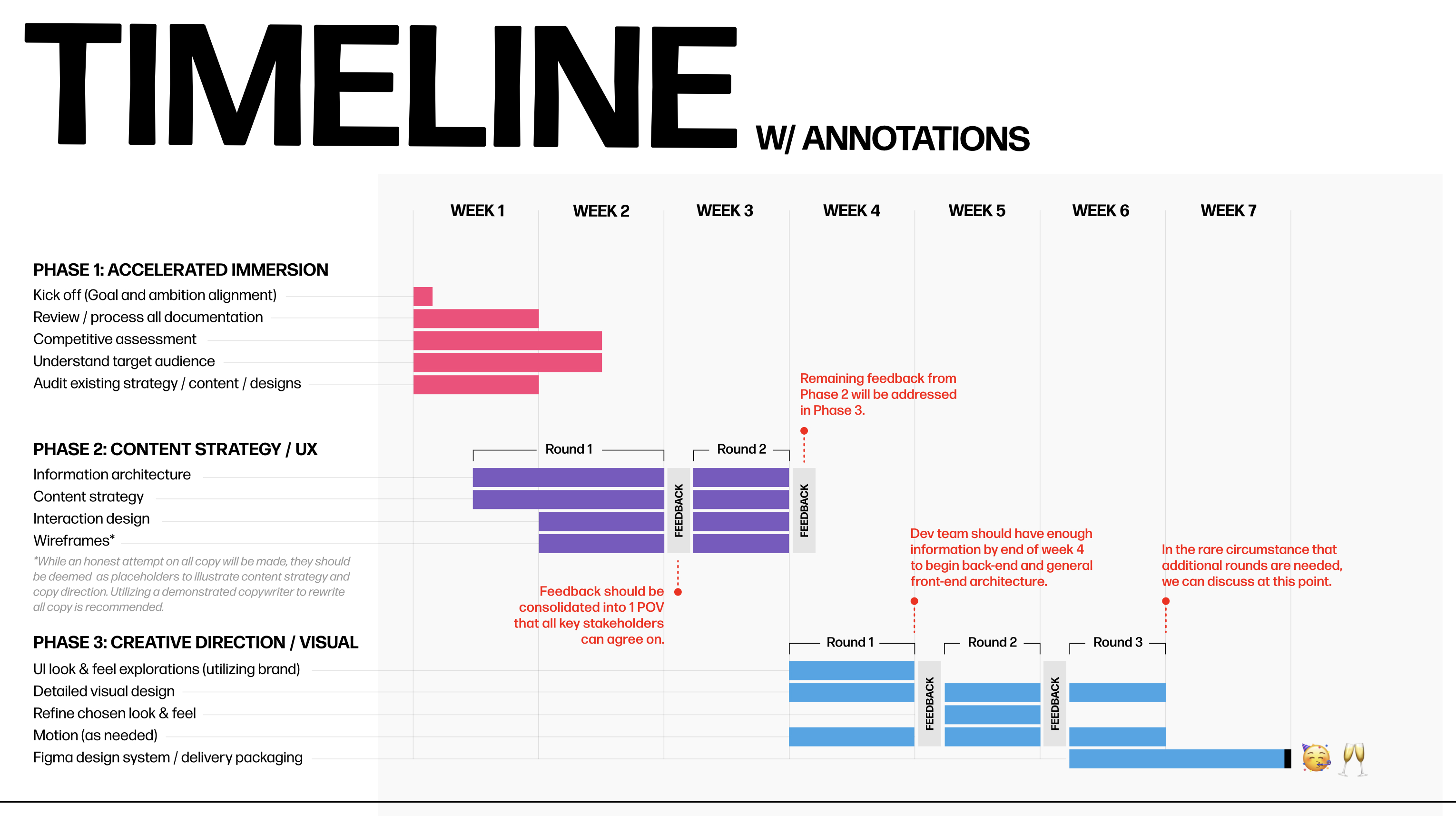
Mapping out the project timeline
Given the complexity of the project with multiple dependencies and deliverables, it was crucial to create a lean project timeline that was versatile enough to accommodate unexpected changes and could still expedite the start of development.
To maintain strong progress throughout the engagement while making the best use of development resources, we provided the following annotated timeline.

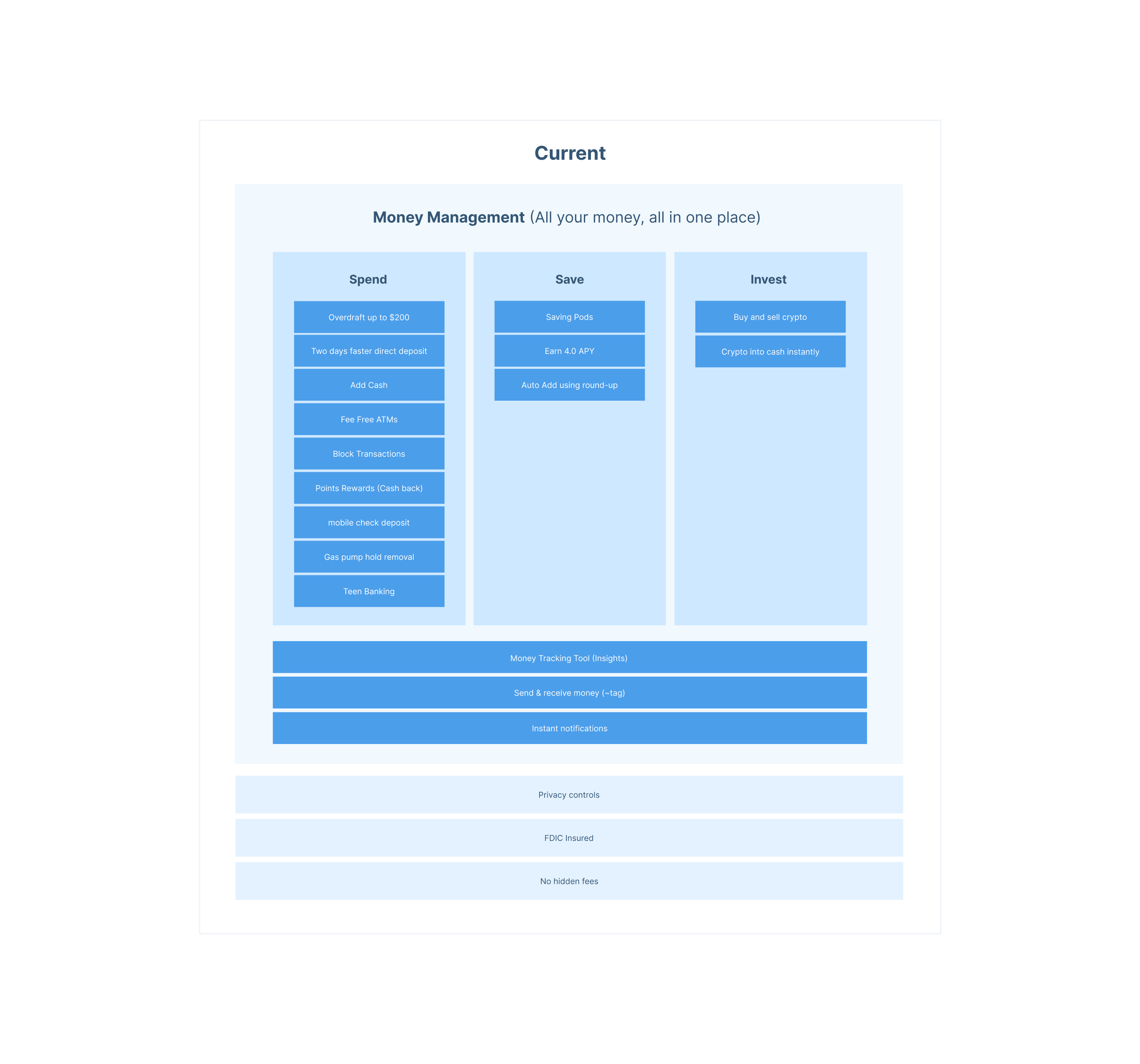
Organizing all of Current's offerings and benefits
As one of the initial steps of the project, we created an information architecture around Current's vast array of offerings. This was an important step as it allowed us to create a clear and concise hierarchy of products and offerings, which would ultimately serve as the backbone of the marketing website.
With a clear sense of product hierarchy, customers could easily navigate the website and understand the various offerings without feeling overwhelmed or confused.


“I love everything about this.”
“This is so much better than what we had. You have translated everything into an elegant website design system.”

